Gateway.jpg

THE TOUR

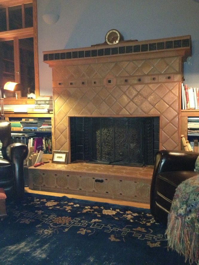
You're at the door into the house, sheltered in a porte cochére formation we call the Gateway.

The Gateway is quite large and includes design elements Chris created for the Commons, deep inside the house. I gave one of the wood medallions from the Commons' ceiling to Steve Roache, the master of Aruba Tile Works on Vashon Island. Steve made multiple copies of it in rough, thick terra cotta taken from Mount Tahoma, a peak dear to the heart of JAG (John A. Graham, the mountaineer who lives here).

When Steve was turning them out, I thought they needed some detail, so I used a stick to cut a pattern of grooves into them. That "ornamentation"—plus leaving them unglazed—has helped the tiles acquire moss and show wear. (Pattern 248 Soft Tile and Brick) The tiles were first set in sand and only cemented in place in 2020. At this writing, we're still working on getting the grout darkened to the right smoky blue.

The lights above the door are massive, found after trying other lights that were just too puny for this structure—the house kinda laughed them off. Then I spotted...old freighter running-lights in a ship chandlery in Anacortes. Perfect. We just had to be sure they weren't visible from the busy shipping channel to the west. Don't want to cause any maritime disasters.

There are birds' nests in them now. Such a warm, dry place to raise a family. Remembering how delighted Chris was when a bird starting building a nest in the raw frame of the house, I figure he'd love the Gateway's tenants.

As you can see, there's a front door bench (Pattern 242). It's Mexican, bought at a swap meet near the Arizona border. Because it's rough, heavy and old, the house likes it.

There's a place you can put packages down next to the door, freeing your hands to open the door. (Pattern 201 Waist High Shelf) It's an old Stromberg-Carlson radio cabinet I bought at a yard sale because it looks like one my parents had. Then I couldn't resist painting it silly colors.

There's ivy climbing one of these posts and a large honeysuckle climbing out of sight on a post to the right. (Pattern 246 Climbing Plants) I was hoping the sun on the honeysuckle would fill the Gateway with its scent, and on rare bright days, it sort of does.

This space is so large, we've used it as an Outdoor Room (Pattern 163) on our so-frequent rainy days—this is the Pacific Northwest. During the pandemic, we set up a handsome square fire-pit in the center and had family over for lunch, bundled in coats, feet up on the fire-pit's sides. The warm terra cotta color of the floor, ceiling, and door help take the chill off too.

At all times, the Gateway connects the structure to the earth (Pattern 168), transitioning you from the gravel where you parked, to the door, or out to the garden.

I'm working on words and pictures about the exterior, so you'll have the full experience of in-person visitors arriving here. For now, out of that order, a look at the Compass Room and the Commons, far inside the structure.

Screen Shot 2021-06-05 at 3.00.57 PM.png

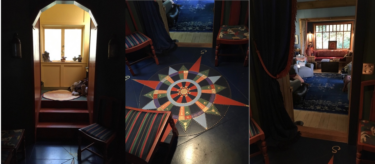
Looking east in the dark compass room...the compass...the view into the commons.

THE COMPASS ROOM AND THE COMMONS

You approach the Commons through what we now call the Compass Room, a small space that first appeared in a doodle Chris made on the back of a receipt from a gas station. He’d been walking in the woods here when the house was just sticks and yellow tape, pondering why what he was imagining wasn’t quite working. There was to be a staircase on one side of the Commons and a door out to the porch on the other side of the room, and that was “disturbing,” a term he used often when something felt off.

His doodle added a tiny room between the dining room, the Commons, the stairs, and door out to the porch. He was—as almost always—right. It was clear at once that getting all that movement out of the Commons would calm the room, a place that needs to be tranquil.

The Compass Room is a dark area between the light in the dining room, the light on three sides of the Commons, and the light from the east, in the stairwell. (Pattern 135 Tapestry of Light and Dark)

The idea of the Pattern is that you’re drawn through the progression of spaces, moving toward the light. Contrary to the instincts of every painter who’s worked on the house, the walls in these dark areas do not need to be painted white to “brighten them up.” The dark colors are deliberate.

As a place of transit, it’s perfect that the floor is filled with a compass, an accurate one. Portland artist Goody Cable created it, sitting on the floor painting it on melamine, handing pieces to carpenters she brought with her from Oregon to help cut and install it fast, before a team from HG (House & Garden) arrived for a photo shoot. Now that's a friend.

Screen Shot 2021-06-06 at 2.56.53 PM.png

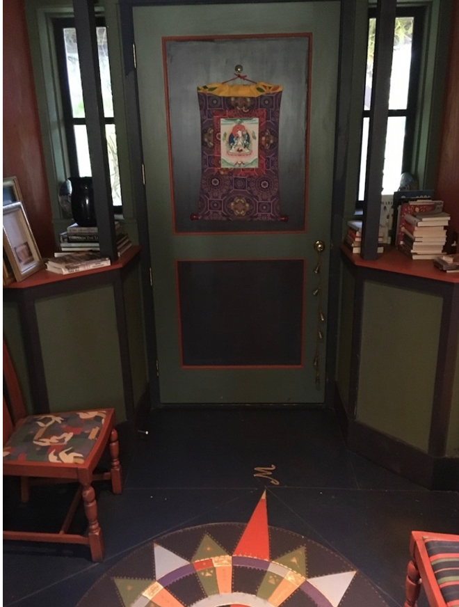
The door out to the porch was An Issue. Two Patterns combined in that door, 134 Zen View, and 135, the light/dark thing. Not grokking that, we imagined coming down the stairs of a morning and looking out glass doors to the stunning view of the Salish Sea and the Olympic mountains. French doors, onto the porch. Of course.

But for Chris it was, Of course not. The door must be solid and, as you can see, he won that one. Having that view available with no effort on our parts would, he said, turn it into wallpaper. Its wonder had to be preserved by knowing it was there, on the other side of a massive dark door, a Zen view. The glass doors in my mind faded away in the logic of what he was saying. And the mountains and the sea have not become wallpaper in the decades we’ve lived behind that solid door.

BlueRoom.JPG

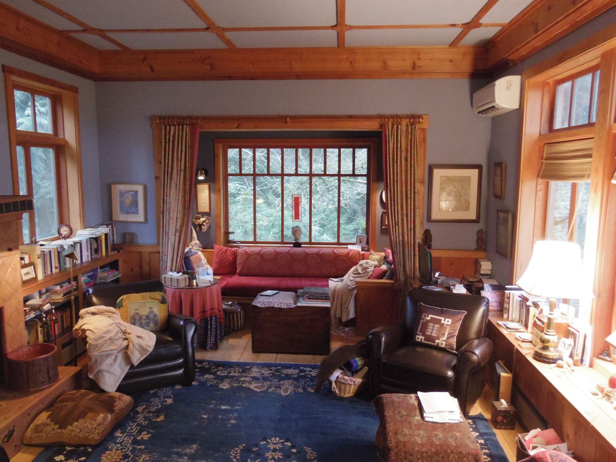
You're standing in the doorway to what Chris calls The Commons in A Pattern Language, but of course most people just call it the "living room." Here's what Tomo Furukawazono saw, standing on the top step to take this wide shot. We thank Furukawazonosan for sending us his images.

Now, as a guest here, you will ignore the mess. That's an order. If I took the time to tidy up before shutters clicked, I'd never get this memoir done. Here's what I can tell you about the room, tidy or not.

When the window openings for the room were being set, Chris stood looking into the forest (on the left of this photo) and said, “I’m seeing green for this room. Bottle green.”

As you can see, I wasn’t. (And his fee for doing interior design was an added $30K, which we didn’t have.) So it’s a blue room, five blues actually, all of them toward red in the spectrum and all of them wonderful with the warm cedar that’s everywhere in the room.

The walls inside the windowseat nook are a darker blue than the walls of the main room, the ceiling of the room lighter than its walls, the interiors of the waist-high bookcases that flank the fireplace the darkest blue of all.

The coloring of the room, and some of its design elements all grew out of a rug I'd had for years. Strangely enough, I'd seen it in a dream once, half a century ago, and then saw it rumpled in the corner of a friend’s garage. She was planning to throw it away and laughingly gave me “that old thing” when I asked to buy it. She’d admired a blue trench coat of mine so I brought that to her in thanks, new blue coat for old blue rug.

That rescued, raggedy rug is now the heart and center of the main room in this Timeless house. There’s something called Shabby Chic, which seems to value things that show wear. I think my love of long-used things goes back to appreciating sabi, the respect I saw for worn, repaired objects when I lived in Japan.

The rug ties the room together; the blues in the walls harmonize with it, the terra cotta of its flowers are echoed in the fireplace tiles and in the cinnabar of the bookcases; its squared-spiral border shows up in a tile band on the fireplace. The rug's pattern also has a definite center, and adds that to the space's sense of order—centers are key to Chris’s discernment of the order that underlies real beauty.

The drapes that can be pulled to enclose the windowseat are a batik from China Seas, and part of a Pacific Rim theme that developed as the house was furnished. JAG and I have both lived in Asia. My dad’s Navy career was mainly in the Pacific, including China, and I spent most of my growing-up on west coast Navy bases.

When Chris’s ever-aware right-hand guy, Gary Black, said something to him about how beautifully the colors in the batik picked up the gold of the room’s cedar, Chris almost heard him. Or perhaps he totally did, but it was hard for him to imagine or acknowledge beauty originating from anyone but him. His work had been one long battle against Philistines—how could anyone else possibly understand the right way to do these things? That mindset could extend to people who agreed with him—It seemed hard for him to take in the strange reality of being understood.

Throughout the house there are Chinese rugs. The chair cushions you see here are from China and Viet Nam. There's a large image of a China Clipper in the dining room, and mementos everywhere of our years of living in Japan and Viet Nam. Looking out the windows to the west, you can see ships of these times bound for Asia, and ships moving toward Seattle from distant Asian ports.

Many of the visitors to the house have discerned Japan in its form, and some of Chris's most important works were built in Japan so that influence here isn't surprising. (Others have thought the place looks English, and that's not surprising either.)

The main seating is four club chairs angled in an X faced in from the corners of the rug, with the fireplace between the chairs on the left. (Patterns 185 Sitting Circle and 181 The Fire) There's a pile of big floor cushions that guests younger than we are can throw around and sit wherever they like, including on the low hearth of the fireplace. And people sitting in the windowseat can either join the conversation or have their own. (Pattern 142 Sequence of Sitting Spaces)

As many as five people have hung out in the windowseat during parties, and it’s a heavenly spot to stretch out alone, for a nap. Both ends are piled with soft pillows, there are cozy throws to snuggle under, and a gnarled apple tree protects the windows from wind and rain. Several family members have recuperated from injuries and surgeries there. It’s a space that comforts and heals. (The Danes have a word for that: hygge.)

Chris writes that the chairs shouldn't match and there should be too many and people should be able to shove them around in new arrangements. That didn't work here. When this room had unmatched chairs, it just looked too busy, and really comfy chairs are heavy. The variety and mobility here come in the pillows and throws.

About throws. I think there's a reason for the name and that they shouldn't be folded. Folded says, Somebody took the time to neaten this and you better not mess it up. Thrown says, Come on in and grab this so you'll be cozy here. Hygge for sure and much more in keeping with Chris's sense of welcoming people into a space.

In his original thinking for this room, there were more windows, and more panes in the ones you'll see throughout this tour. Pattern 221 Natural Doors and Windows is a directive to make the size and shape of each window unique, perfect to its place in the structure. What do you see from there? How much light is coming in? Should the sill be high or low for its height in the building? (Pattern 222 Low Sill) How many panes should it have? (Pattern 239 Small Panes)

Windows are a very big deal in a Pattern Language building.

Each unique window was to be made by a superb craftsman, to Chris's specs. There were no ready-made windows that could possibly work. It would all be done within budget, according to Chris, but he didn't account for double-panes, an environmental requirement. He roundly objected, his only goal being beauty, not long-term reduced fuel use. So crew boss (and Chris's brother-in-law) Curt Brown set to work sketching out fewer windows and fewer panes in the ones that survived, so the windows didn't bust the budget. In a rare moment of acknowledgment, Chris looked at Curt's drawings and said they were exactly the changes he would have made himself.

Chris came to me when this space was barely framed, bringing the terrible, awful, you’re-going-to-be-upset news that there wouldn't be windows in the wall on each side of the windowseat.

I shrugged and said, Good. Room for pictures. As always, he seemed startled that I didn’t share his distress or argue with him about the importance of those two windows. When your whole artistic life has been dealing with opposition, a lack of it can be puzzling.

As you can see, this was something less than a catastrophe. The etching on the left, where there would have been a window if we were rich, is by British artist Brigid Marlin. It’s a depiction of Isis and Osiris. On the right is a beautiful encaustic image—"Balance Point" by Lynn Hayes.

OK, another end-of-the-world-disaster that wasn't at all: that large window in the windowseat? When the space was newly framed up, Chris stood there looking out and decided there couldn't be a window there at all. What? Well, the view was just awful. An ugly pile of rubble.

That was a case of a "given" that needn't be accepted. The pile had been created by a bulldozer and we just fixed it with the same machine. The land was smoothed out, and an apple tree planted. It's old and gnarly now, and has never produced an apple but is nevertheless quite beautiful.

Chris “did” the ceiling, something that rarely happens in contemporary buildings. It’s always just wallboard up there, right? But this ceiling is wood bordered with a heavy wood crown and crossed with a pattern of battens and medallions. Chris drew the size and shape of the medallions, the carpenters cut and placed them. Rusty Biggs, an ace among painters, sealed the amber-gold of the wood while painting the background the lightest blue in the room, without taping any of it and without getting a drop of blue on the wood. (He’d painted a lot of San Francisco Victorians.)

The Sistine ceiling it’s not. It’s simple and rough and strong, sheets of plywood helping stabilize the structure while visually holding the top of the room together as the encircling built-ins do embrace the bottom.

There’s light on three sides of this room, giving it wonderful shifting patterns as the sun moves from the high windows on the eastern, forest side, round to the almost-never-was windowseat window, then over to the west as the sun moves beyond the sea, to set behind the mountains. (Pattern 159 Light on Two Sides of Every Room) Two is a minimum to shape objects in the room with fewer shadows. Three goes beyond that into gorgeousness.

Way on the upper right, something ugly. Don't tell Chris, but we switched from baseboard heaters to heat pumps; the power bills were just too high and we needed to improve the air quality with the pumps' filtering function. This was the least-awful place to put a pump; the contractor of course wanted it above the windowseat alcove, which would indeed have been more efficient. So we went for beauty over efficiency, as Chris would have done.

Screen Shot 2021-06-06 at 3.08.41 PM.png

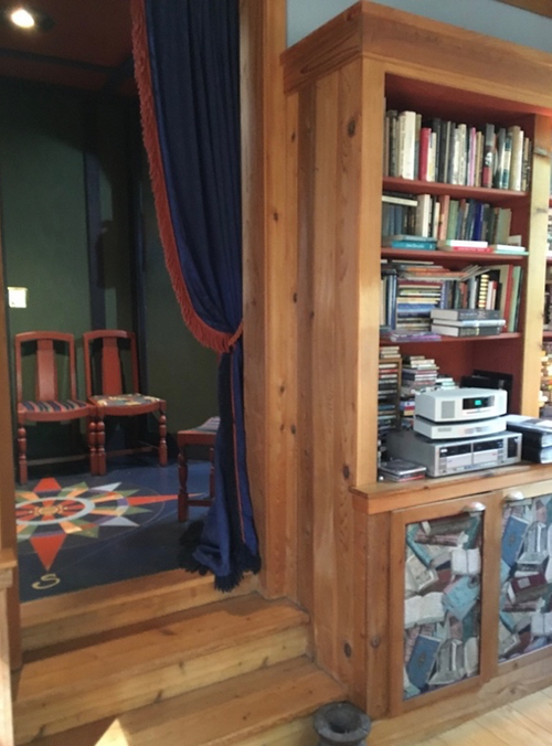
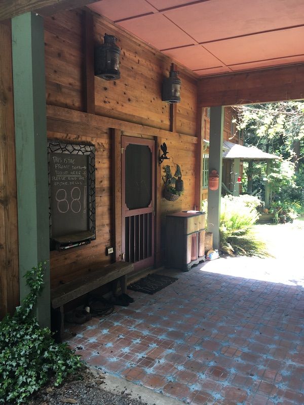
There are three steps down into the Commons, making the room’s ceiling the highest in the structure, ten and a half feet. Coming down into this place, you know that you’re in the heart of the house. (Pattern 190 Ceiling Height Variety)

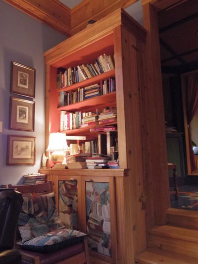
This opening in the wall is thickened with deep, built-in bookcases, giving a sense of strength to the passage. Everywhere in the house, transitions between rooms are beefed up, so there’s no feeling of fragility at these points. (Pattern 225 Frames as Thickened Edges)

Oh. The dark blue drape there? It can be pulled across the doorway when we want to control the temperature in the Commons, like when there's a power outage and we're huddled in this room with the woodstove going. At other times, it's just timelessly handsome, posing there on one side of the doorway. The fabric has a pattern of Romanov eagles woven into it, which made me smile when I saw the yardage at GUM, the then oh-so-grim department store in communist Moscow's Red Square. It was the time of perestroika—things were changing so much we'd been invited there to talk about Giraffe Heroes. But czarist symbols in GUM? Amazing.

CommonsEastWindow1.JPG

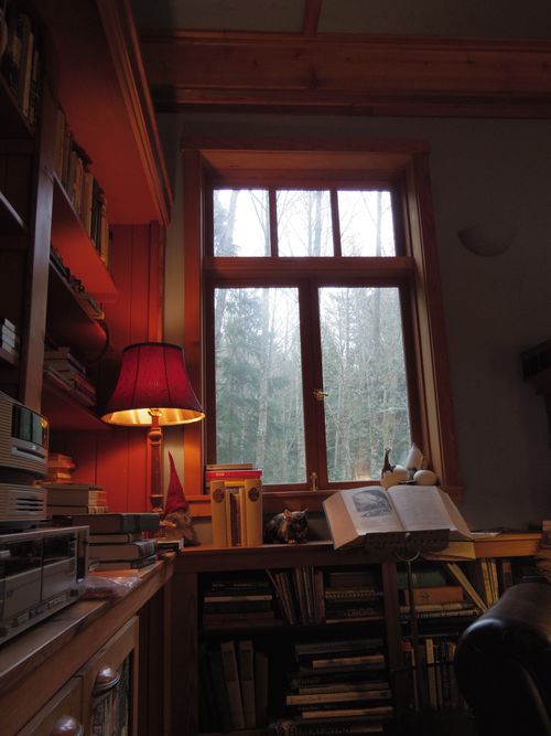
Look to your left, as Tomo did for this shot, and you'll see a high window onto the forest. Because the whole house was positioned off the edge of the only flat land on the property, the building rests on a massive, triangular, concrete base, angled down a slope. (Pattern 104 Site Repair) It’s a long way down from all of the forest-facing windows so the sills are high, making it feel quite safe to look out and down. Here, that’s further enhanced by bookcases that give you a place to lean, making the house feel even more like a bastion against all dangers. (Pattern 201 Waist-High Shelf)

“To feel safe on the upper stories of a building, one wants more enclosure, smaller windows, higher sills—and the higher off the ground one is, the more one needs these psychological protections.” (From Pattern 221 Natural Doors and Windows)

I couldn’t agree more with this one. Long years of living in New York put me in many a skyscraper with ceiling-to-floor glass walls, 30 stories up. I could not walk near such walls and would find myself holding onto furniture as close to the center of the room as I could get.

There's no way you can feel insecure standing at this window.

The reveal here, and those throughout the house, was created by the ribs of the house being 2 by 10s instead of the standard 2 by 4s. Add the inner and outer surfaces, and the exterior walls are a foot thick. (Pattern 211 Thickening the Outer Walls) In addition to adding to the sense of being safe inside the house, that thickness makes it all wonderfully quiet.

In this time of just-good-enough-to-get-by, the County inspectors stopping by to be sure we were observing all safety regulations kept shaking their heads. The place was so "over-built." Didn't we understand that the industry standard was 2 by 4s? We very much did understand and had decided that even though it was costly we'd put all the money we had into good bones, into things that couldn't be changed later. You can always upgrade surfaces when you put more money together, but if you've messed up the bones, there's nothing you can do about that.

CommonsDoor2W.JPG

Look to your right, you see the doorway's west side, more bookshelves adding thickness and strength.

CommonsFire+windows.JPG

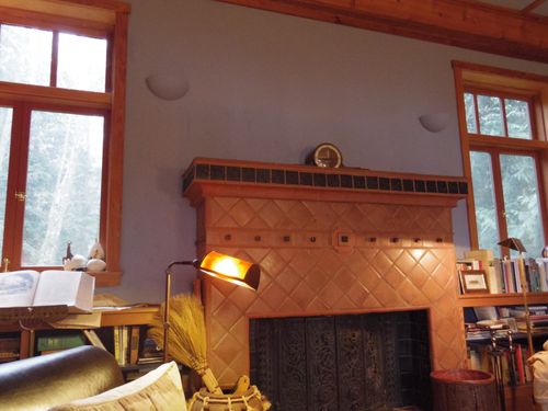
East again, the "cold" side of the room, high windows onto the forest, on each side of a fireplace, its warmth countering the dark, chilly woods. Those uplighting sconces on the wall? Chris likes uplighting. I don't, so there have never been bulbs in them.

Ah, the fireplace. In Chris's thinking, the high windows would flank a Rumford fireplace, a form he dearly loved, tall and shallow, its base level with the floor—a stand-there fireplace, without a sitting hearth.

Rumfords went out of style in the mid-nineteenth century and are, no doubt, worth reviving. However, this is the Pacific Northwest, a gray, rainy place where the long, steady warmth of a woodstove is much preferable to an open fire that needs constant tending.

We knew that Chris would see a woodstove as an ugly intrusion into the space, so an approach strategy had to be devised.

After a conversation about the Norwegian stave churches he greatly admires, I showed him pictures of a beautiful Norwegian wood-stove that’s a fireplace insert, not a freestanding stove, with stave designs in its cast iron doors.

We had a deal. And it included a raised hearth we can sit on.

Screen Shot 2021-06-25 at 2.30.48 PM.png

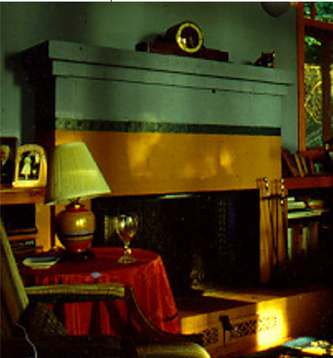
But it wasn't always that handsome tiled wonder in Tomo's photo. When we moved in, having run out of time and money, it was bare cinder-block, mega-ugly. We did a "temporary" fix with paint. Not green as the photo seems to say—the upper part was the same blue as the walls, as a way to minimize its huge cinder-block presence.

The temporary solution was in place for 24 years. Then we had the money to do this...

WhidbeyFireplace copy.jpg

This. Probably the best experience of co-creation in the entire history of the house. Working again with Steve Roache of Aruba Tile and his installers, all women, was a model of how a team can shape a vision and make it real in the world. Steve's done all the tile in the house—this capped it all in wonder.

I have photos of the process and I think I'll show you just how it was done. Yeah. I'll do that. Tomorrow.